Documents in System Garden are structured and built up from an ordered list of components that are defined by a template. The use of a template allows similar formats to be maintained across your projects and means that automatic design integration is made as simple as possible.
The templates are built by the template tool - click on Document Templates from the navigation to enter it.
You are presented with a template selection list; click on an existing one to start editing it or click on + Create a new template to start a new template. Each template is a multi-version asset like designs, so its possible to see old versions and roll back - more on how this works with documents in the document tool section.
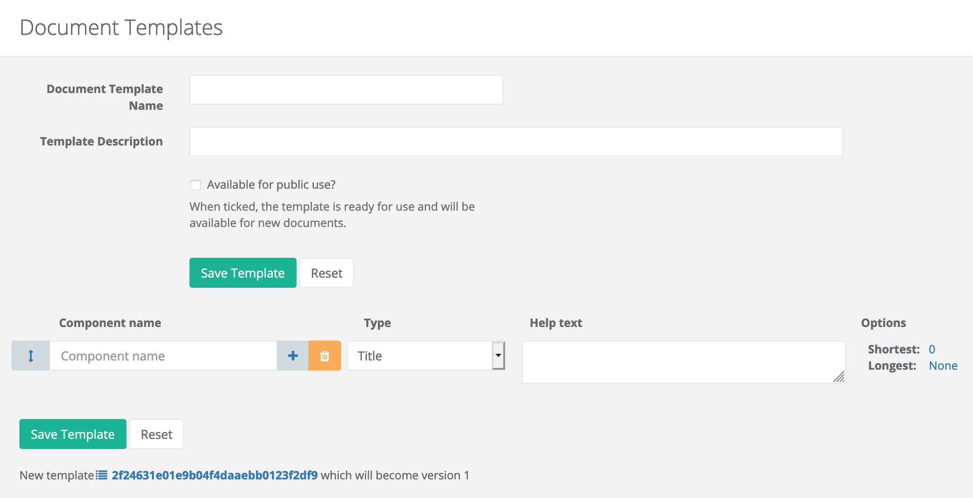
Below is the start of a new template, which starts with a name and description, a flag to publish the template for others to use and a single row which is currently blank. Each row in the template represents a component or part in your document, and multiple rows can be added to form a larger overall document.
Each row has several graphical and data elements, described below.
⬍ Reorder icon
When there are multiple rows, click and drag on this icon to reorder the components.
Component name
The name of the component which becomes the heading for the component when used as a document.
+ Add a row below icon
Click on this icon and a new blank row is created below the row with the button.
Component type
A selection of parts types that can be chosen. Detailed below.
Help Text
Associated with each component name is help text, normally printed underneath the document when being edited. It helps to explain how to use the component in the context of the document. When a document is printed or rendered read-only, help will not be shown.
Options
Type specific additional options. Each type may have options to alter how the component is shown for editing (height for example) or how it will be shown in the final document
The component types include the following:-
Title
Title of the document, independent of the document name. Appears in a large font and suitable for the top of a document
Description
Description of the document, independent of the design description
Section Heading 1 (2 and 3)
Named section breaks, naming provided by the template and fixed when editing the document
Text Line
A single line of text
Text Box
A block of text without formatting capability
HTML
An HTML editor allowing formatted text, links and image references. Currently image storage is not supported
Markdown
An edit that uses markdown as a formatting standard. Image storage is not currently supported
URL Link
A single anchor link to an HTML page
URL Image
A single link to an image
Number
A simple numeric value
Design Selection
When used in a document editing context, this selects the design with which the document integrates. All the component types prefixed by design are automatically generated from this selection
Design Drawing
Show an image render of the selected design
Design Title
Title of the document taken from the document name
Design Description
Description of the document taken from the document description
Design Value
Show a four part table showing the monthly cost of the design, capital expenditure, time to build and its expected life
Design BoM
Show the design's Bill of Materials as a table of infrastructure components
Design Configuration
Show the configuration of each infrastructure component, if they can be altered
Design Networks
Show details fo any networks in the design
Design Control Points
Show the details of control points that can be used to integrate designs
Design Revisions
Show a history of design versions
Document Revisions
Show a history of document revisions
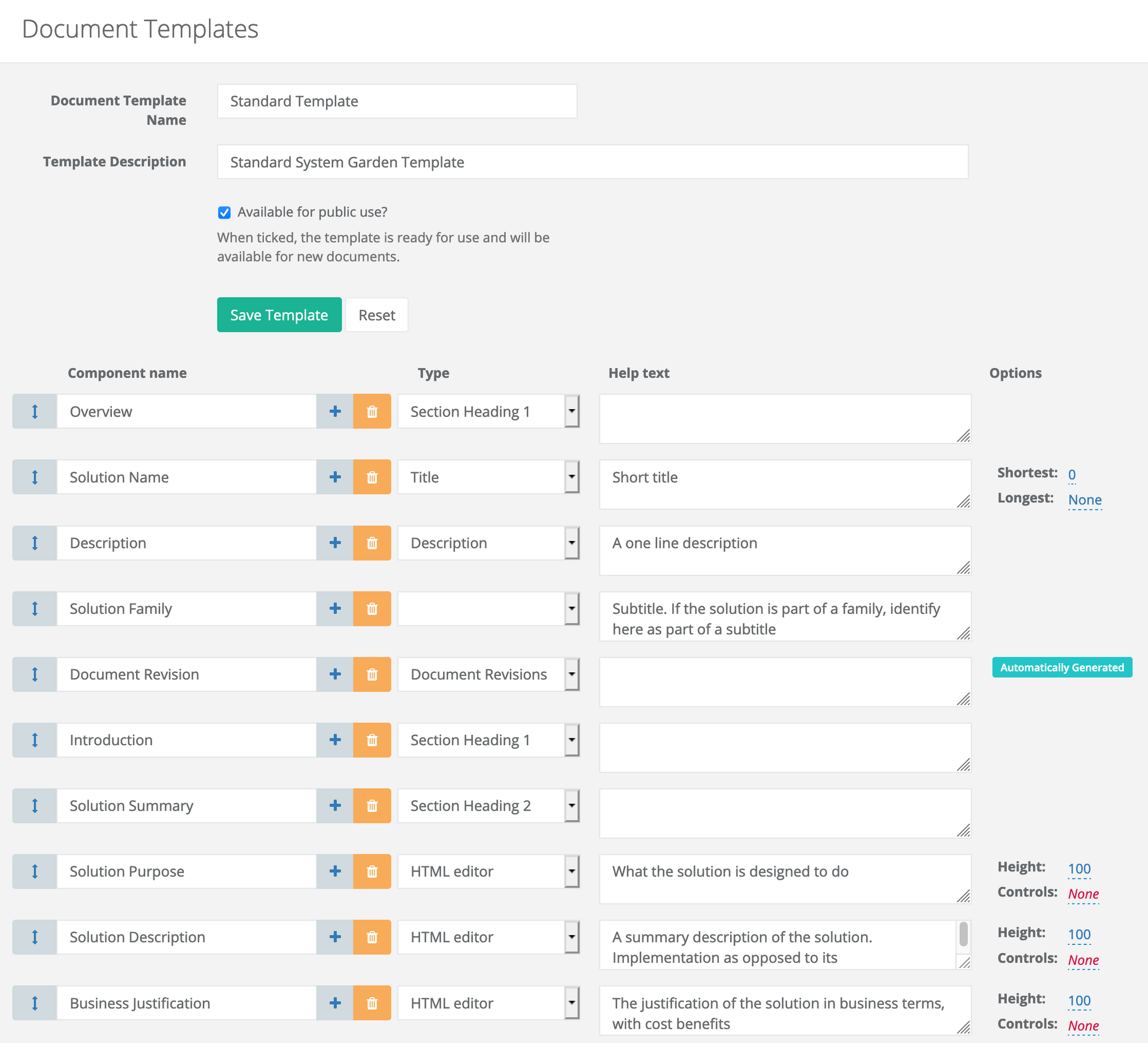
An example of a more complete template is shown below

