Once the design has been saved, you are placed in the selection window. From here, there are a number of operations that can be carried out.
Browsing Designs
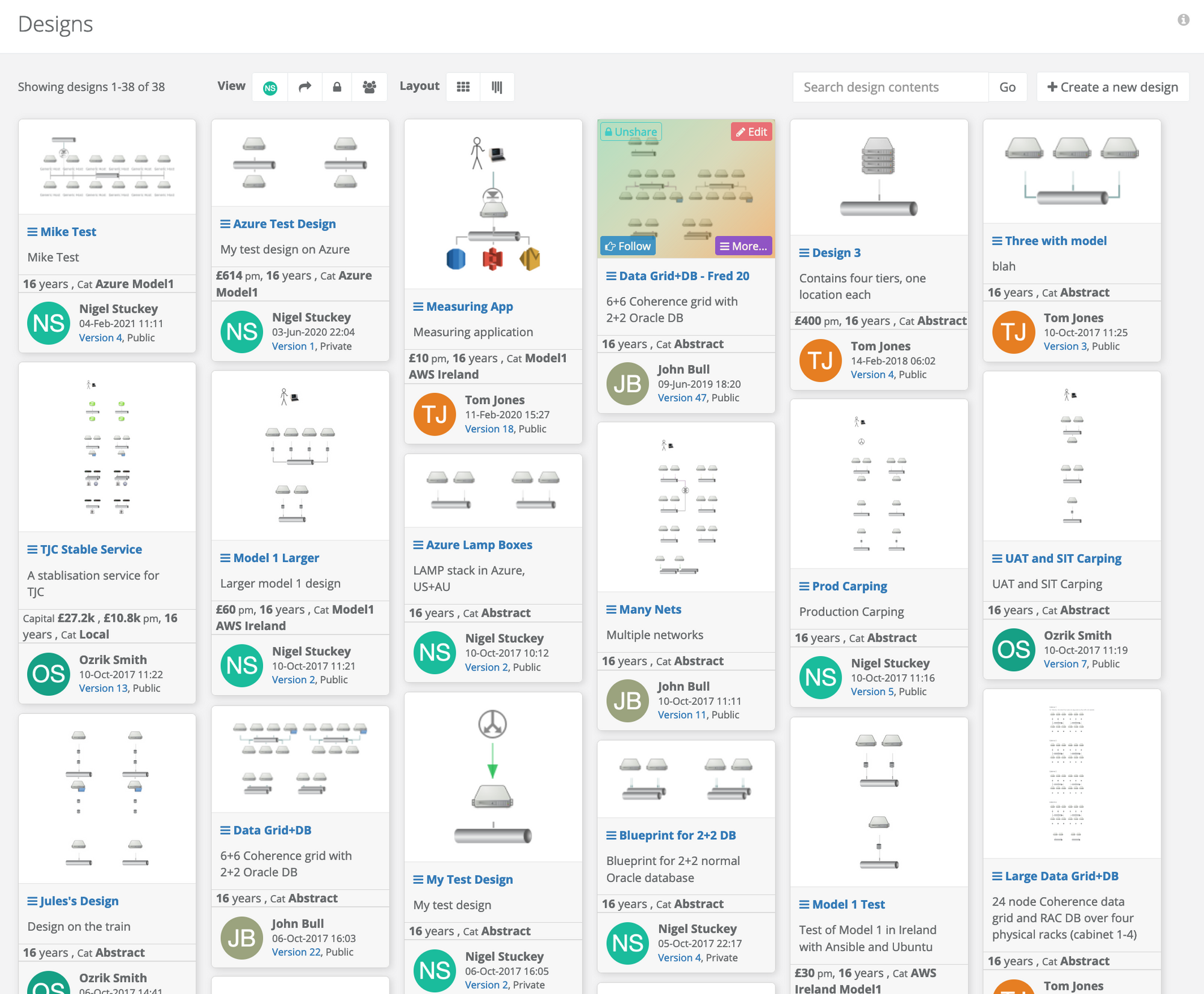
Selecting the design tool or exiting a design editing session, dispays a grid of designs in tiles. The information contained in the tiles include the title, description, cost and a catalogue.
Two buttons over the image include Followand More... to allow the user to follow design changes and to present an expanded range of options. If you have rights to design, there are also Public and Edit buttons that make the design visible to other users and then allow you to make changes. Clicking on the image will draw a read-only view of the design.
At the top of the images are two clusters of buttons. Layout buttons eliminate white space to produce a compact layout oriented in columns or insert more space to align in rows, which many prefer for readability.
The second buttons select the design being displayed
Everything public plus my private designs, the normal view
Only my private designs
My design shared and private
All shared designs
The designs are order by date.
Menu Actions
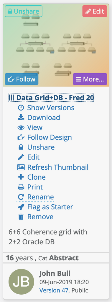
Clicking on the More... button or clicking on the title expands to produce an enhanced list of actions
Show versions
Prints a grid of past design versions
View design, read-only
Displays the read-only view with an option to edit if there is permission
Follow / unfollow design
If the design changes, you will be notified
Share / unshare the design
Share makes the design public so others can use and it can be deployed. Unshare will make the design private. Private designs are used to develop architectures until they are ready.
Download
The design's download page, from where the compiled orchestration can be copied or HTML and PDF renders of the design can be downloaded.
Deploy
Send this design and version to be deployed
Edit design
Clone or copy the design
When copied, the most recent version will be installed as version 1.
Rename
A pop-up appears for you to type in a new name
Print
Opens a read view of the diagram and places the user into the print dialog with its preview window (depending on browser)
Remove
Refresh thumbnail
On occasion, it may be necessary to regenerate the thumbnail of the referred version. Thumbnails take a few seconds to render.
Flag / unflag as a starter
When flagged, the most recent version will appear as a base design when creating new designs.
Search Designs
A search bar at the top of the page will find text in the title and descriptions of the designs that can be read by you (have been made public).
Following Designs
From the menu action, clicking the follow option will include you in any changes that are carried out on the design. Notifications will be pushed to all your configured services. This option is great if you want to be notified of changes that other authors have made to the design.
Clicking the button in the menu will toggle it from follow to unfollow. There is also a button in the corner of the thumbnail.
Opening Different Versions
Selecting More... and Show versions will show the history for that design in an array form with thumbnails. Each design card represents a version and has the same menu buttons as the regular selection (as above). So, selecting More... will let you View or Download that version.
You are able to edit a historic version from this display. If you subsequently save it, your changes will become the most recent version, bypassing other subsequent changes. It may be appropriate to use File→Save as... when editing an historic version to form a history fork.
When a design is forked (save as...) or cloned (duplicated), then a new history identity is started. Versions within the identity are an ordered list, numbered from 1 and run to the head which is used by default for all operations.
Currently, merging of histories is not supported.
Reading and Editing
Clicking on the image of a design with view a read-only rendering in full screen. This is a similar view to the print and download appearance.
From the read-only view, there is an edit button at the top right of the display if you own the design and you have the right to edit. The design is launched in the editor at the selected version.
Alternatively, a design can be edited by overing over the thumbnail and clicking on the edit button in one of the corners of the image. Clicking More...->Edit also has the same effect.
Printing Designs
Designs can be printed from the read-only view, click on the Actions button and click Print. It can also be triggered from the selection menu, More...->Print.
A print render is generated containing the design image and key information about the design, such as its IDs, Keys and costings. The print preview from the browser is triggered, allowing the user to check what is to be printed before the final print button pushed.
Downloading Designs
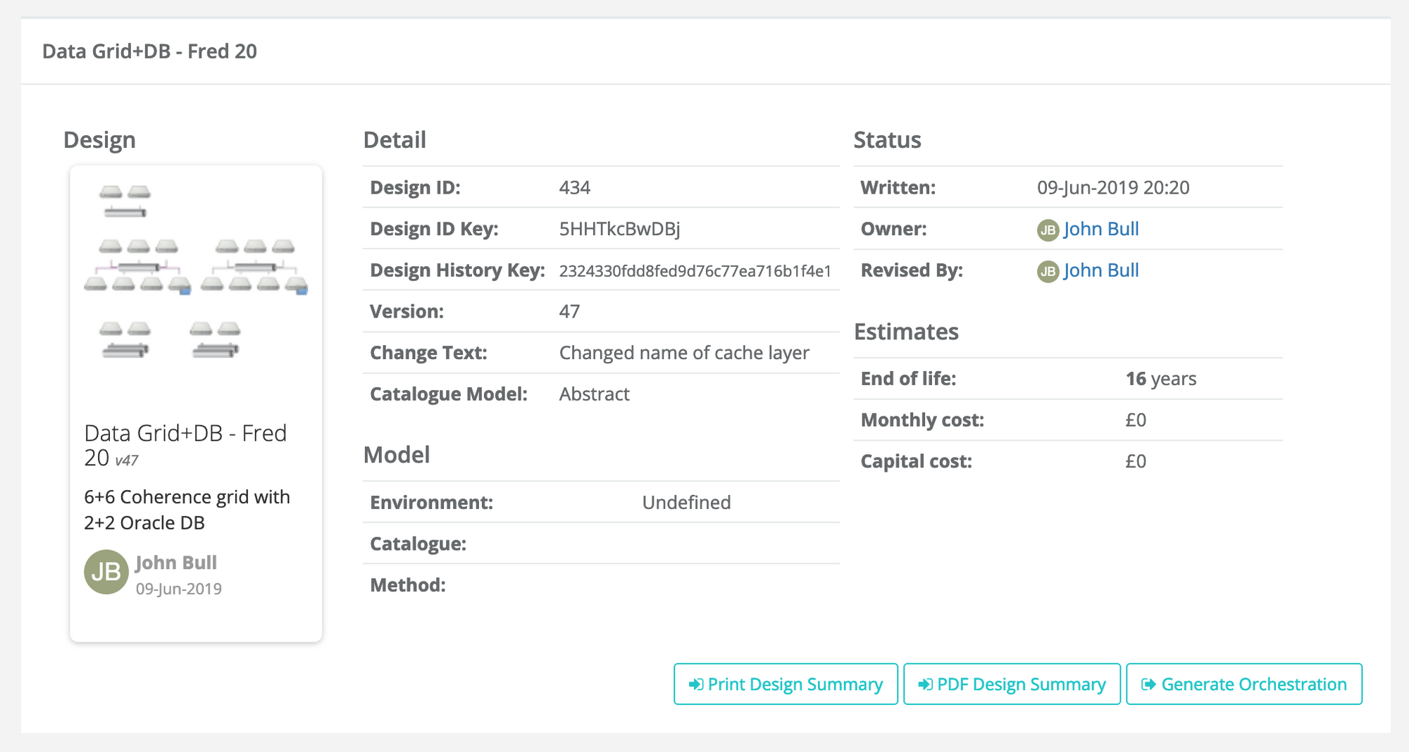
Clicking on More...->Download shows the design version in a card with a thumbnail and various pieces of information. Information includes IDs, the specific version, ownership and costs.
Below that are three buttons
Print Design Summary
Displays a page that summarises the design on a page with details regarding the design that are similar to the download card (IDs, keys, costs, etc)
PDF Design Summary
Renders the same information from (1) above in the format of PDF
Generate Orchestration
Download the orchestration compiled from the design, with embedded warning and errors as comments if supported by the orchestration format. This would normally be sent directly to the infrastructure provider by the deployment tool.


